


Name and Logo
HISTORY
Former Crossroads League Commissioner J.D. Collins initiated a re-brand effort to update and revive the identity of the Central Indiana based athletic conference. In the Fall of 2011 Collins began the re-brand process by performing a thorough primary research study to replace the current brand. The re-brand process included institution presidents, athletic directors, coaches and sports information directors. Along with the institution leaders, Collins worked closely with a college athletic consultant, 2D Consulting. The conference then hired Intersection, a branding agency, to take the lead on re-creating the name and visual identity of the conference. These partnerships took shape in early 2012.
The purpose of the re-brand effort was to fully discover the heart of our league. The committee scoured the country for conference naming concepts, identifying strong performers and trends to find inspiration for a rename. The creative brief of the re-brand process inspired designers to visually represent the characteristics of our league. Some of those include: athletic, bold, speak to prospective student-athletes, and embody the core values of our institutions.
After a thorough re-brand process Intersection presented the new brand in late April 2012. Collins' strong satisfaction with the new brand was echoed unanimously by all ten institution Presidents.
As of July 1, 2012 the Mid-Central Conference became known as the "Crossroads League".
NAME
The "Crossroads League" name is made up of several key attributes. First, the name has a subtle faith-based application by using the word "cross". Secondly, it has a regional play in that Indiana and the Midwest are the Crossroads of America. Next, using the word "league" sets us apart in that there are no other "leagues" in the NAIA. Lastly, the name is short, tangible and highly memorable.


Primary Logo Secondary Logo
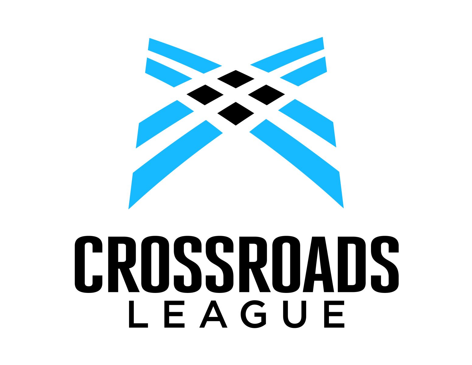
LOGO
The "Crossroads League" logo is made up of unique subtleties and key attributes. To begin, the logo is very progressive and the logo is an abstract "X", which is a fitting representation of the word Crossroads, and a natural athletics reference (X's and O's).
The four black squares represent the four pillars of our Faith proclaimed in Mark 12:30: "Love the Lord your God with all your heart, soul, mind and strength." There are also subtle, yet numerous and deeply woven Christian crosses incorporated into the negative space of the logo.
The repeating lines, which represent highways crossing, incorporate regional attributes from the area in which the league resides.
On the "athletic field" side, the logo has representation of nets—basketball, soccer, volleyball and tennis. It also has representation of bases for baseball and softball. The unique representation in the logo of a "track" in the sweeping lanes for track and field and cross country.
Finally, the logo fosters brand affinity today and lays a firm foundation for long term brand equity to support changes in the future. "Our league now communicates, both visually and through the name, all of the things our institutions hold dear; our unique faith, top-flight athletics and our foundation in the Midwest," said Collins.
CROSSROADS LEAGUE
The Crossroads League is a ten-institution athletic conference in the NAIA. The Crossroads League offers 17 year-round sports throughout Indiana, Michigan and Ohio. The league will continue to be a pioneer in academic excellence, competitive athletics and a faith-driven focus on and off the field. The Crossroads League consists of ten colleges and universities: Bethel College (Mishawaka, IN); Goshen College (Goshen, IN); Grace College (Winona Lake, IN); Huntington University (Huntington, IN); Indiana Wesleyan University (Marion, IN); Marian University (Indianapolis, IN); Mount Vernon Nazarene University (Mount Vernon, OH); University of Saint Francis (Fort Wayne, IN); Spring Arbor University (Spring Arbor, MI); and Taylor University (Upland, IN).
LINKS TO NAME AND LOGO ARTWORK